Redesigning my Website
Most things I've designed looked like I was an engineer. But over time things have improved!
2020-11-12
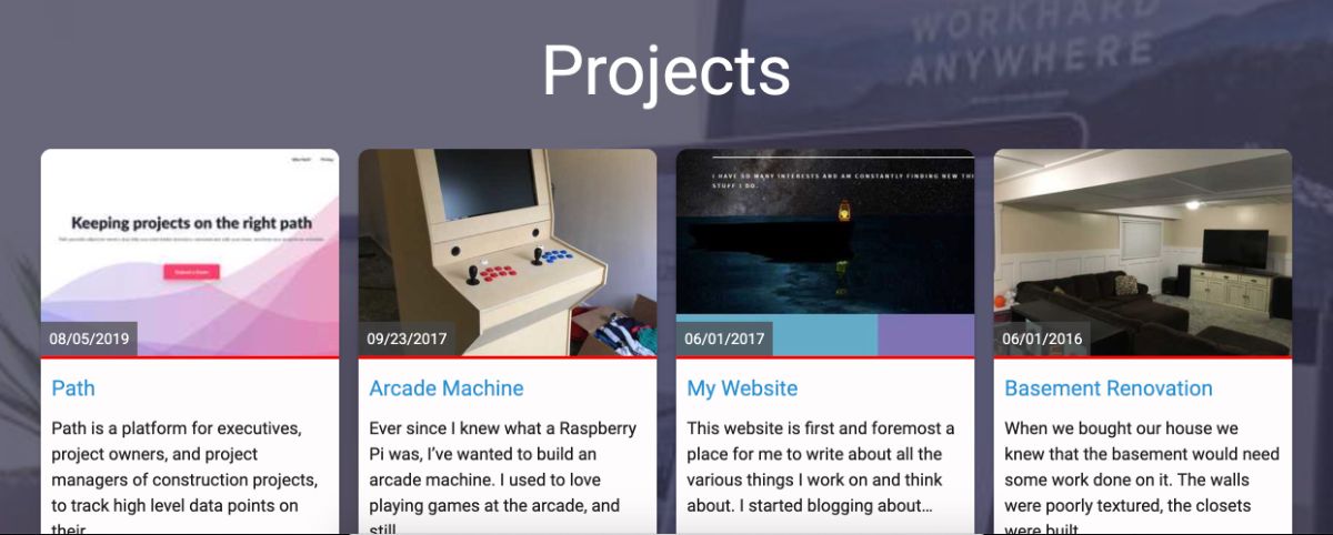
In the last few months, I have spent some time off and on redesigning my website. It originally started as an exercise to practice doing some design work in Figma, and it quickly turned into a full-blown re-imagining of my website. As any great engineer knows, you haven't built it right until you have rewritten it 3 or 4 times. And while I did not replace the underlying engine of my website this time, I did alter almost every part of it, and now it is complete.
Through this process, I have learned a few things about design, about blogging, and about the inner workings of gatsby, so I thought I would share a few of them.
Blogging
I have been running a blog for the better part of a decade now. It was a place to post pictures and findings while I worked on my Sega Dreamcast Portable with a Blogspot website. (It's actually still up and running at modsbywerd.blogspot.com) Many years later I learned how to host my own website and I happened to discover that matthewsessions.com was available. I immediately jumped on that opportunity (who doesn't want to own the domain for their name?) and began writing articles about programming. It has evolved into a great place for me to record interesting things I find and projects I undertake.
But then I made a discovery.
People actually read my blog
It came as a bit of a surprise to me because I had always just posted things I had worked on and the problems I had solved. But over time the more I wrote, the more people would come to read. I started digging into my analytics and there is a strong correlation of visitors with when I post new articles.
That's great, I thought. Not only is this a great way for me to record my work, but others seem to find it valuable. I have gotten emails and tweets thanking me for things I have written. And have had fun seeing what websites link back to my articles. (Side note: one of my posts was referenced in an O'Reilly book on React Native which was fun to discover).
Learning about the usage my website has, and the number of people who have benefitted from things I have written has relit a fire for me to be more consistent with posting new content.
Gatsby
Gatsby has turned into a fantastic tool to build my website on. It's very technical, which for me is perfect. I have complete control over the things I want control over, (layout, content, UX, design), and the parts I don't want to deal with are handled for me (image optimization, bundling, code splitting).
gatsby-node.js
In the process of getting all my content on here, I've had to learn a lot, especially about gatsby-node.js. Just because there is a plugin, doesn't mean it works, and therefore it is good to get your hands dirty with gatsby-node.js.
One thing I've seen on other's sites, that I really enjoy is their list of books they have read, (jaketrent.com/book), because it gives me a lot of good recommendations. So that was something I wanted to include on my site. But all of the gatsby plugins to pull in data from Goodreads were broken. So after exhausting all my options, I realized I needed to write my own. (Maybe a blog post in the future?)
Design
Although I am an engineer, I have had enough experience rubbing shoulders with designers, and implementing their designs, to at least know some intuitive basics about user experience. But design? Not really. I have not devoted enough time practicing design to be very good at it. But over time I have practiced a lot, and while I'm still not great, I've improved a lot. And that all started when I was introduced to Figma.
Figma
Figma is a design tool for app/web design (probably more). I first learned about it when the designer I worked with started using it. He would send me the link to our projects and I immediately discovered a few things.
- It's free
- It works as both an app and a website
- It has most of the features Invision previews give you.
I was sold quickly and began to consider picking up some design skills. But I wasn't sure where to start. So I asked my designer friend how to start learning some design.
Dribbble
Dribbble is a place for designers to show off their work, and collect feedback from other designers. It's a treasure trove of fake applications, or a designer’s attempt at redesigning an existing application. My friend's advice to me was to look there for ideas of what you want your designs to look like, and copy it. And while Dribbble isn't a great place to learn UX, there are plenty of examples that you can modify, combine, and copy, to get where you want to be.
Final Thoughts
This blog post was supposed to be relatively short, and it became a bit lengthy. But in short, I have enjoyed redesigning and building out my ideas. I've learned a lot and tried a lot of different ideas out before landing on my current implementation. And with the added benefit of knowing people get value out of my content, it's really helped encourage me to take it more seriously, and get some more content out there. So stick around, and hopefully, there will be more to come.